Wednesday, April 27, 2011

Painting Simple Shapes

I'm trying to get back to foundations and this is one of my attempts. So the thing about painting simple things is that they're not that simple. This guy turned out to be a pretty good challenge. I'm getting better at mixing compliments to make various shades of neutrals. Work has trained me pretty well with saturated colors and painting class is getting me better at desaturating.


Sunday, April 24, 2011

Plein air at Flatrock Park

Went home for easter and did some painting at flatrock park. Haven't worked with oil for a few weeks now and it shows. Need to practice more.


Wednesday, March 30, 2011

Painting class

Here is my latest painting. I wanted to upload the underpainting last week, but it was stuck in the trunk of my car that was getting worked on. Should have taken a picture when I had a chance. Anywho, not bad for two classes, but I need to work on some more things.

Friday, March 25, 2011

Palette and Chisel

Went to figure drawing at Palette and Chisel in Chicago. Pretty cool place and a lot of fantastic art and artisits. I'll try to post a link when I get home and can access my computer. Doing all of this from my phone. It's so cold up here! Here are some of my better drawings.


Monday, March 07, 2011

Painting Update

Just an update to a painting i'm working on. Need to add some more color.

Thursday, March 03, 2011

Another Painting Update

Been busy as hell at work lately and I'm forcing myself to take a moment and breathe! Here is my latest update to my still-life. Next week I'm really going to make that flower pop!


Wednesday, March 02, 2011

Color Theory Pt. 2!

I'm SO TIRED. So what do I do when I'm exhausted? Take a nap? No. I take a break from drawing and painting and look more into color theory! So yeah, I know I'm a little obsessed with this whole color thing, and I know that there really isn't any way to prove it one way or the other, but I thought I'd take a crack at it. By the way, if anyone really is interested in color theory, get James Gurney's book, Color and Light. It will open your mind! 
So here are some experiments that I did with some oil pigments. Trying to adapt pigments to the RGB and CMY color wheel really is hard because I lack a control. You could also say that these experiments work for the Munsell Wheel, and that'd be fine because both color wheels are pretty interchangeable.

So how do you create a control? Well, I need a primary color and a secondary color and I seemed to lack  either/or. Probably the closest color I could come to recreating was Yellow. I mixed Cadmium Yellow and Cadmium Yellow Lite (Cadmium Yellow light probably would have worked just fine). Cadmium Yellow Lemon, although brighter and more saturated, just seemed way too cool to be a pure yellow. I proceeded to mix yellow with Permanent Violet (purple was always taught to be the compliment of yellow in school) and got a brownish color, not a pure gray.

I tried Ultramarine Blue and Cadmium Yellow next. Many people online have said that Ultramarine Blue is close to true RGB Blue in hue. This is not so. Of course, I got green. I know RGB Blue is a very warm blue, so I mixed Ultramarine with Permanent Violet and then mixed that with my True Yellow concoction. Eureka! I got gray! (the mixture looks a little too violet on my tray because I didn't mix the blue and violet very evenly on the left side). I did a few more tests with Ultramarine Blue and several yellows, Yellow Ochre being the closest, but still too green to be a gray.

Red was next. I don't have cyan, so again, I had to improvise. Gurney says Phthalo Cyan is the closest thing to true cyan, but that only comes in watercolor. I mixed Viridian and Verditer Blue (Cerulean Blue and Titanium White). I know RGB Red is a warm red…orangish, so I used Cadmium Red Lite. Remember, Lite doesn't mean it's a lighter tint, it means it leans toward the yellows. Deep leans toward the reds. My mixture made gray!

I also did some orange tests, even though orange is a tertiary color for RGB and CMY. Cerulean Blue and Cadmium Orange takes the cake.

Magenta. Where to begin? I tried my Rose Violet, but it's just too warm for Magenta. It's a shame, because I love using magenta to paint digitally. It mixes so well with reds and blues. I also don't have a green. I used a Viridian and Sap Green hybrid. Oh well. I gave up on that one.

So, what did I learn out of all of this besides the fact that purple and yellow are not compliments and that the RYB color wheel doesn't work? I think I learned that it really doesn't matter. You're never going to need three colors to make all the colors, so who cares? As long as you have a good set of paint, and know what colors are next to what and what combinations make gray, you'll do fine. It doesn't matter what is primary because the true gamut is so far beyond what pigments can actually reach, you might as well just remember that all color is relative. In fact, that is the golden rule: All color is relative…period.

Monday, February 28, 2011

Alot of Sketches Later…

Well, I've been painting weekly, but I didn't make the deadline for the contest. I did enter my Apoc painting though. So, we'll see how that goes. It's amazing how much you realize you don't know when you start really painting something from memory or imagination. I have this idea for a forest nymph, but my lack of knowledge of forests or anatomy is hurting me here… I may have to postpone my first two-month deadline :-( Anyway, let me know which is a better composition.

Thursday, February 24, 2011

Art at Joe's

Well, got some figure drawing in at Art at Joe's! Went with some coworkers tonight and I will say that I was pleasantly surprised with my performance. Here is one of my better sketches of the night. Also, I discovered photoshop express, so now I can doctor my photos on my phone a bit before I put them on the blog. Sans scanner or computer is awesome!

Sunday, February 20, 2011

Primary Colors

And the great battle over the true primary colors continues. It seems that there are alot of heated arguments over the internet about what the true primary colors are. Coming from a design and digital background, I tend to think that the subtractive primaries are cyan, magenta and yellow. Black has to be used to give you a full color range in print because, well, they are subtractive primaries and are brighter than the subtractive secondaries (red, green and blue). 
So I keep trying to prove my theory and it works quite well on a computer screen. If you look at the picture, the three middle mixes on the left are as close to using true cmy and rgb as a computer can do nowadays. If you mix these colors, you should get absolute grey. Now I mixed these using a tablet in Corel Painter, but they seem pretty close to all being the same. The problem comes when I try to repeat it with what Painter says are select oil colors. I used Cerulean Blue (should have used Light Cobalt Turquoise), Ultramarine Blue, Quinacridone Magenta, Cadmium Red, Cadmium Yellow Lemon and Pale Cadmium Green. These gave me more of a warm brown than a neutral gray. The problem is that there aren't many paints out there that can get the brilliance of Cyan and Magenta. They're just too far off the gamut for most reflected light. I guess objects aren't as great at absorbing red and green light as they are with other colors.

EDIT: Let me correct myself real quick. The problem isn't the saturation. The problem is the hue. If I could find paints that are somewhere within the given hue of magenta and cyan, I could make a better color wheel, even if these paints were somewhat desaturated. True, I couldn't mix as many variations of color with desaturated subtractive primaries, but I could at least see if they would make gray if I mixed them with green or red.
In my mind, it seems better to think about color as something made up in our brains when our eyes register light. In reality, the true color wheel (the additive color wheel) would have red, green and blue as primaries. These prismal colors mix to make the rainbow: red, (orange is a tertiary) yellow, green, cyan, blue. Magenta isn't seen in a rainbow because red and blue light never combine into the brighter magenta because they are at the opposite sides of the rainbow. If artists can stop thinking in subtractive color, and start thinking in additive (keeping in mind the process of light being absorbed in their paints) maybe they can make better paint mixtures. I realize that it all comes down to experience and knowing what paints to mix to create your own greys, browns and desaturated pigments, but maybe these ideas will help with estimations for newer artists.

Feel free to leave comments. I'm not married to this idea, but it's something that i've been trying to work on as I paint. Also, keep in mind that RGB red is a warm (orangish) red and blue is a warm (somewhat violet) blue.

Tuesday, February 15, 2011

Painting Class

Well, I finished this session's painting class. Here is my latest stuff. I also put my pallet on because it was more of a work of art than the painting. To any that are interested, I'm taking Charles Wall's class at Binder's in Buckhead.
On another note, I discovered a Blogger app for my Android and can now blog from my phone, so this is just kinda awesome :-)

Monday, February 14, 2011

Sketch update


Well, here is my work from the past two weeks. I few more Campbell studies and some painting. I also added a page from my sketchbook that I used to do some studies of the painting before I started. Unfortunately, I have been extremely busy with moving and work stuff, so the art has been lacking a bit. I'm going to try to make up for it this week. Only two weeks till I have to have a painting done!


Monday, January 31, 2011

Sketches for the week


Some sketches I did while looking at Scott Campbell. Trying to get better at my line quality and drawing hot women. My line is still a little too sketchy for my taste and the overall flow isn't working out for me yet. I can always see my weaknesses when I use pen. Too much of a painter I guess. Also, this is my final touchup on the painting up top. Added some purer reds and upped the saturation a bit. Looks alot better in person. I think the camera tends to balance out the contrast some. Ah well.

So, I have to say, this stickk.com thing is actually getting me to get some work done and now that i'm starting to get used to it, I think I'm going to up the ante a bit. My goal for February is to make a submission to ballistic publishing. I'm moving this weekend and then I can totally dedicate myself to it, so wish me luck!

Monday, January 24, 2011

Few Sketches and Painting Progress


Well, week two of Stickk.com and I can already feel myself dwindling. Still trying to get back to my roots and not make this a chore. Drawing should be fun, right!? Anyway, my progress on the painting is going well. Tomorrow is my last day to work on it and then we are switching to a live model. It was a long day today and I didn't get as much drawing in as I would have liked. Monday is normally my productive day, so this is kind of depressing. The next few weeks are going to get busy as hell because I will be moving soon. I can do it though! One month to completing a painting!

Monday, January 17, 2011

Stickk.com


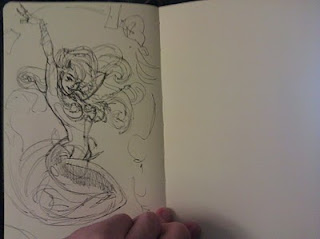
Well, it's been a while I suppose. So my best friend and I are trying this New Years resolution thing where he works out and I finish six personal paintings this year. We're using a site called Stickk.com and refereeing each other to make sure we stay accountable. The site takes money out of our account and gives it to our ref if we fail for the week, so it's pretty good at keeping you motivated :-) My goal for this week was to just do some sketching and try to remember why I enjoy drawing. I feel like the biggest problem I've been having is that I consider drawing, 'work' when it should just be good ole fashion 'fun.' 

I started off drawing some video game fan art like I did when I was a kid. Everything was done from imagination (except the painting which was from a painting class I had) and I suddenly know all of my weaknesses when it comes to anatomy and perspective. I need to keep drawing from imagination so I can remind myself what I need to work on and to just have some fun. Anyway, next week I want to focus more on what my painting will be about and get some thumbnails in. Taking it slow at first so I don't kill myself. Let me know if you want to support me on stickk and I'll send an invite so you get weekly updates.

Thursday, September 23, 2010

Back at Art at Joe's!


Well, been a while. I've been kinda stressing and not getting much of anything done between work and the convention, but I want to reassess things and get back into some figure drawing. Painting classes have been keeping me going steady as far as doing things outside of work (and I need to upload some of my latest still!), but I need to pick up the pace some. For those of you that don't know, I was at the Anime Convention in Atlanta this past weekend, and although it smelled, and was hot, and loud, I managed to get into drawing stuff that I actually enjoyed and didn't consider 'work.' I had forgotten what it was like to sit down and draw just to have fun and not try to meet certain goals and timelines. It also allowed me to really see what I need to improve. So, here is to me getting back into art for the fun of it!

I got to draw from a male model tonight for the first time in almost two years… I think. Anyway, it's been a while and it was kind of refreshing. This is from the final pose of the night and probably my best. Still trying to figure out the best way to sketch with a pencil. My years of cartoon drawing make me rely heavily on outlines, but I think my painting experience is getting me away from that and allowing me to focus on form and value a little better.

On a side note, I am in the process of revamping my website (for real this time). I'm ditching pure html for a template website that also does hosting, but it is very customizable and I feel it will allow me to update more often and allow for easy changes/editions. My blog will also be moving from blogger to my new website. I'm real excited and can't wait to get it up and running! Hope everyone is doing well. Feel free to comment and let me know what you're up to!

Wednesday, July 07, 2010

Massive Update

Soooo… yeah. I've taken WAY too long to update this thing. Things at work have been moving incredibly fast and I feel like I am just now starting to get my footing back. Thank god for painting class. Anyway, here is some stuff I've done over the past few months just to prove that I've gotten a few things done… mostly through class :-/


Sorry for the bad pics. I need to get better at photographing paintings


EDIT: So I just realized that I had ALOT more paintings that I haven't posted. I just put the semi-good ones on. I also rearranged them so the oldest was last and the newest was first…I think. Anyway, I guess I should explain some of them a bit better. I've been working on my figures alot and have been trying to get the colors right. Skin-tones have always been hard and will probably be hard for the rest of my life. I've noticed that my shadows are way too dark in my earlier paintings and have been trying to fix that in my later ones without adding white paint. They look a little better. Still have a ways to go, but i'm seeing improvement :-)


Wednesday, February 03, 2010

Painting Class 2.2.10


Happy February! So I guess this really is the month of love because we finally got to paint a model tonight in my painting class! Charles has been a big help. Here is my latest in progress.

Things to remember:
1) Skin is luminous: add a little bit of white in shadows to really make it glow. Rules are made to be broken.
2) As the shoulders go further back into the distance, add some of the background color to show atmosphere.
3) Paint the basic shapes first, and if something is mostly in shadow, paint it all in shadow and add the highlights later.
4) Don't paint highlights too yellow. Add some blue. We are using a cool light, so highlights must be cool.
5) DON'T GET CAUGHT UP IN THE DETAILS. Treat it like you would a vase or a pot. People recognize overall shapes, values and tones first.
6) Don't paint shadows brown. Add some cadmium red, ultramarine blue and/or alizarine crimson to get some saturation going.

Thursday, January 21, 2010

Figure Drawing Mom and Daughter


Had a pretty good figure drawing class tonight. I feel like I've loosened up alot when it comes to drawing people, but still not where I want to be yet. Alot of catching up to do. Tonight we had the privilege of drawing one of the models that has come back after having her baby girl. She even managed to keep the baby from crying the entire time! Came close though.

Things to Remember:
Babys' eyes are not located in the center of the head like adults or children. The eyebrows are in the center  and the nose is at the bottom fourth.  The bottom of the eyes are halfway between the bottom of the nose and the brow.

Quest for perfection


Ugh! The pain. So I sat down tonight to do some drawing for fun. Started on some faces (all from imagination) and moved on to the body. This is probably the only thing worth posting. I've realized something. I've realized I'm starting to remember how to draw. It's slowly coming back to me. Unfortunately, I'm also remembering all the things that I have been meaning to work on. Things that I was wanting to work on a year and a half ago. Ugh. So much time lost. I've been mindlessly copying figure contours at figure drawing instead of trying to learn REAL anatomy from them. Damn women hips. Why are you so hard to draw!? You're round, but you're flat, but you're round. And hands… don't get me started on hands… So much to learn. I was about to start learning folds and fabric a year and a half ago too.

SO, time to figure out how to do this. With me, I tend to grind experience (forgive the WoW reference), then do the big battle. But I need to get some actual work done instead of constant studies. I need to figure out this balancing act. I can't be constantly studying and not doing anything with substance.